Monthly data analysis
Download Sample Files
SST data
Python script & Figures
Time series plots
Map plots
Combined plots
Analysis
Land-sea mask
The NOAA OI SST dataset filled the fake values over the land produced by linear interpolation. To identify the ocean area, they also provide the land-sea mask file. The land-sea mask consists of the grided values filled by 1 over the land and 0 over the sea. This example shows how to mask the land area using the Xarray.DataArray.where function.
# == netcdf file name and location"
fnc = 'oisst_monthly.nc'
dmask = xr.open_dataset('lsmask.nc')
ds = xr.open_dataset(fnc)
sst = ds.sst.where(dmask.mask.isel(time=0) == 1)
Anomalies and Climatology
The most prominent feature of climate data is the annual cycle called climatology. The climatology represents the seasonal cycle and generally consists of one value in each month. Climate scientist characterizes warmer/colder climate or anomalies by comparing with the climatology. We define anomalies as the deviation of climatology. As a result, the dimension size of time is 12 for climatology and the data length for anomalies. The following is an example for Xarray to calculate climatology and anomalies using groupby.
clm = sst.sel(time=slice('1982-01-01','2020-12-01')).groupby('time.month').mean(dim='time')
anm = (sst.groupby('time.month') - clm)
Output of DataArrays ‘clm’ and ‘anm’ looks like this:
print(' ---- clm ----')
<xarray.DataArray 'sst' (month: 12, lat: 180, lon: 360)>
array([[[-1.7900007, -1.7900007, -1.7900007, ..., -1.7900007,
      ...,
      [       nan,        nan,        nan, ...,        nan,
              nan,        nan]]], dtype=float32)
Coordinates:
  * lat      (lat) float32 89.5 88.5 87.5 86.5 85.5 ... -86.5 -87.5 -88.5 -89.5
  * lon      (lon) float32 0.5 1.5 2.5 3.5 4.5 ... 355.5 356.5 357.5 358.5 359.5
  * month    (month) int64 1 2 3 4 5 6 7 8 9 10 11 12

print(' ---- anm ----')
<xarray.DataArray 'sst' (time: 476, lat: 180, lon: 360)>
array([[[ 7.1525574e-07,  7.1525574e-07,  7.1525574e-07, ...,
      ...,
      [           nan,            nan,            nan, ...,
                  nan,            nan,            nan]]], dtype=float32)
Coordinates:
  * lat      (lat) float32 89.5 88.5 87.5 86.5 85.5 ... -86.5 -87.5 -88.5 -89.5
  * lon      (lon) float32 0.5 1.5 2.5 3.5 4.5 ... 355.5 356.5 357.5 358.5 359.5
  * time     (time) datetime64[ns] 1981-12-01 1982-01-01 ... 2021-07-01
    month    (time) int64 12 1 2 3 4 5 6 7 8 9 10 ... 9 10 11 12 1 2 3 4 5 6 7
Regional average
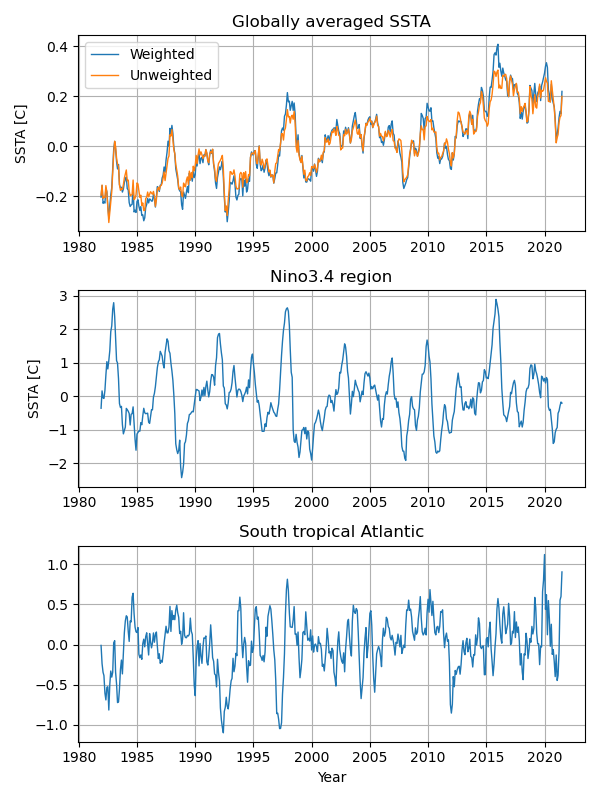
We can simply calculate the globally averaged temperature anomalies like this.
glob=anm.mean(("lon", "lat"), skipna=True)
The above approach assumes that all grid points have the same area. However, the areas in a general latitude-longitude grid are a function of the latitude, which requires a latitude-weighted area average. The following function calculates the latitude-weighted area average. This function is also applicable for the longitude range from -180 to 360.
# -- regional average
def wgt_areaave(indat, latS, latN, lonW, lonE):
  lat=indat.lat
  lon=indat.lon

  if ( ((lonW < 0) or (lonE < 0 )) and (lon.values.min() > -1) ):
     anm=indat.assign_coords(lon=( (lon + 180) % 360 - 180) )
     lon=( (lon + 180) % 360 - 180)
  else:
     anm=indat

  iplat = lat.where( (lat >= latS ) & (lat <= latN), drop=True)
  iplon = lon.where( (lon >= lonW ) & (lon <= lonE), drop=True)

#  print(iplat)
#  print(iplon)
  wgt = np.cos(np.deg2rad(lat))
  odat=anm.sel(lat=iplat,lon=iplon).weighted(wgt).mean(("lon", "lat"), skipna=True)
  return(odat)

gave=wgt_areaave(anm,-90,90,0,360)
nino=wgt_areaave(anm,-5,5,-170,-120)
atl=wgt_areaave(anm,-20,0,-30,10)
Running mean and standardaized
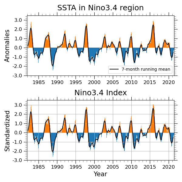
A function DataArray.std calcuates the standard deviation. We can also apply a running mean filter using a function DataArray.rolling with a option. Here is an example, which applys a 7-month running mean filter. You may prefer a option center=True to keep the center point for filtering.
nino=wgt_areaave(anm,-5,5,-170,-120)
ninoSD=nino/nino.std(dim='time')
rninoSD=ninoSD.rolling(time=7, center=True).mean('time')
Sample program: nino_index-v3.py
Detrending
This is an example for a linear detrending function.
# -- Detorending
def detrend_dim(da, dim, deg=1):
    # detrend along a single dimension
    p = da.polyfit(dim=dim, deg=deg)
    fit = xr.polyval(da[dim], p.polyfit_coefficients)
    return da - fit

# -- Running mean
ranm = anm.rolling(time=7, center=True).mean('time')
rdanm = detrend_dim(ranm,'time',1)
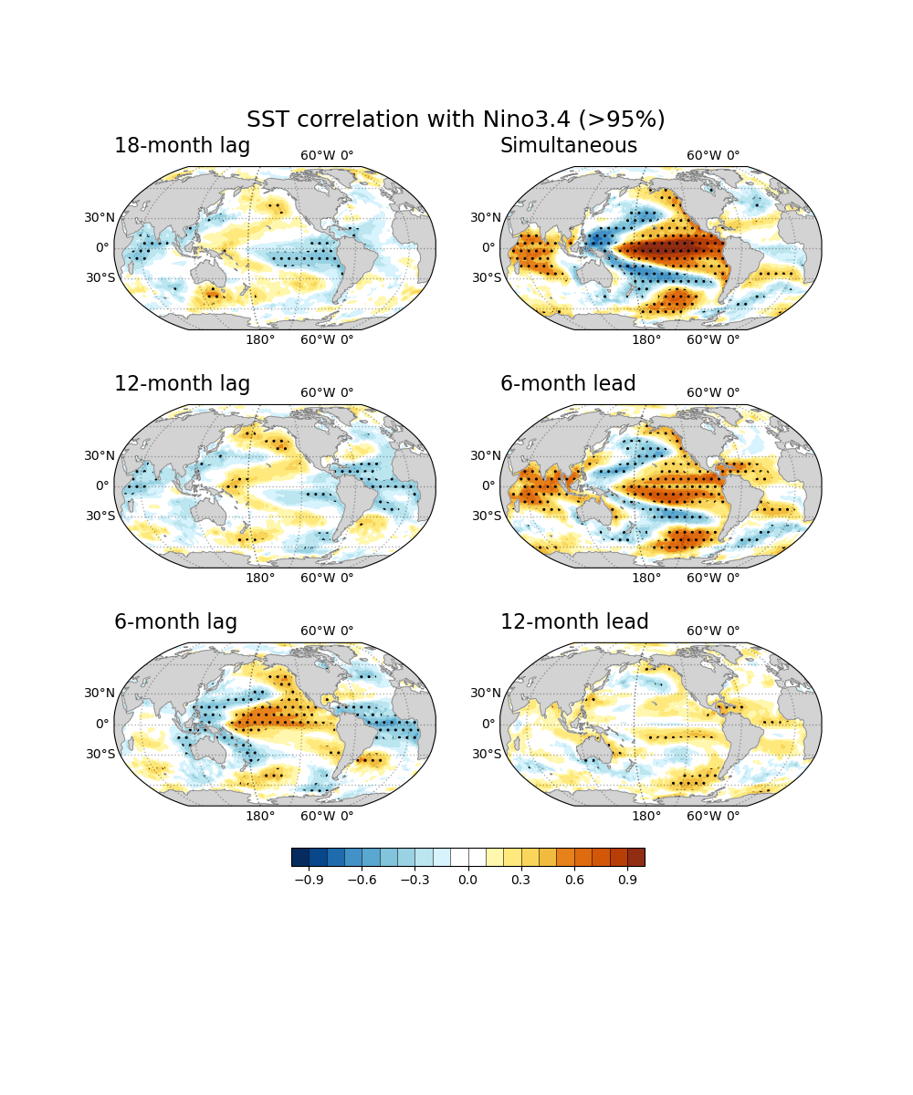
Correlation & regression
cor0 = xr.corr(rninoSD, rdanm, dim="time")
reg0 = xr.cov(rninoSD, rdanm, dim="time")/rninoSD.var(dim='time',skipna=True).values
Sample program: month_leadlag_cor_reg-v2.py
Lead-lag correlation
# Leading
corM12 = xr.corr(rninoSD, rdanm.shift(time=-12), dim="time")
regM12 = xr.cov( rninoSD, rdanm.shift(time=-12), dim="time")/rninoSD.var(dim='time',skipna=True).values
corM6 = xr.corr(rninoSD, rdanm.shift(time=-6), dim="time")
regM6 = xr.cov( rninoSD, rdanm.shift(time=-6), dim="time")/rninoSD.var(dim='time',skipna=True).values

# simultaneous
cor0 = xr.corr(rninoSD, rdanm, dim="time")
reg0 = xr.cov(rninoSD, rdanm, dim="time")/rninoSD.var(dim='time',skipna=True).values

# Laging
corP6 = xr.corr(rninoSD, rdanm.shift(time=6), dim="time")
regP6 = xr.cov( rninoSD, rdanm.shift(time=6), dim="time")/rninoSD.var(dim='time',skipna=True).values
corP12 = xr.corr(rninoSD, rdanm.shift(time=12), dim="time")
regP12 = xr.cov( rninoSD, rdanm.shift(time=12), dim="time")/rninoSD.var(dim='time',skipna=True).values
corP18 = xr.corr(rninoSD, rdanm.shift(time=18), dim="time")
regP18 = xr.cov( rninoSD, rdanm.shift(time=18), dim="time")/rninoSD.var(dim='time',skipna=True).values
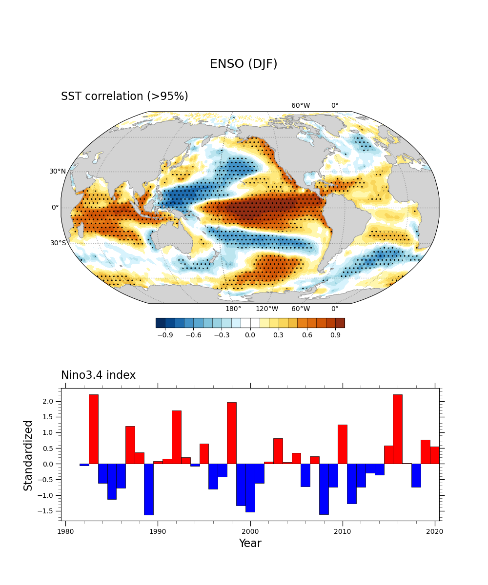
Significant test for correlation
This is an example of two-side Student t-test for correlation at 90% and 95% significance level with 40 degrees of freedom. The sample script makes a correlation plot hatched by dots in the region above 95% level. We require the package ‘SciPy’ to conduct the statistical test.
from scipy import stats
Using a function stats.t.ppf, we can calculate t-value based on the degrees of freedom and probability.
  # Plot Hatch

  df = 40
  sig=xr.DataArray(data=cor.values*np.sqrt((df-2)/(1-np.square(cor.values))),
      dims=["lat","lon'"],
      coords=[cor.lat, cor.lon])
  t90=stats.t.ppf(1-0.05, df-2)
  t95=stats.t.ppf(1-0.025, df-2)
  sig.plot.contourf(ax=ax,levels = [-1*t95, -1*t90, t90, t95], colors='none',
      hatches=['..', None, None, None, '..'], extend='both',
      add_colorbar=False, transform=ccrs.PlateCarree())
Sample program: sstDJF_nino_cor-v1.py
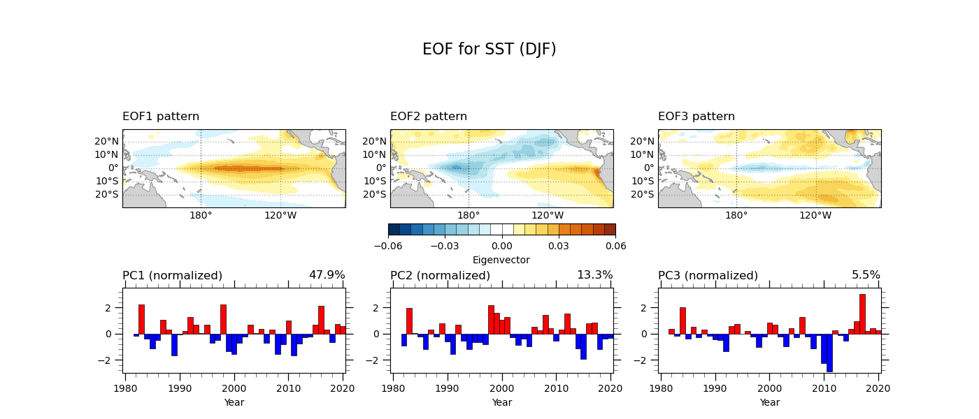
EOF analysis
The Empirical Orthogonal Function (EOF) analysis is a statistical tool commonly used in climate science. It defines the dominant modes by decomposing 3-dimensional climate data (time, latitude, and longitude) into the spatial pattern and time series. In this example, we apply EOF analysis to sea surface temperature anomalies averaged for the boreal winter (DJF).
We use general python packages as shown below. There is excellent documentation for EOF analysis by GeoCAT (here). This example uses the package geocat.comp as highlighted below. We also define the year and the region to apply the EOF analysis here. The parameter neof = 3 indicates the number of leading EOF modes.
import numpy as np
import pandas as pd
import xarray as xr
import os
from datetime import datetime

import cartopy.crs as ccrs
import cartopy.feature as cfeature

import matplotlib.pyplot as plt
import matplotlib.patheffects as PathEffects

from scipy import stats

import geocat.viz.util as gvutil
from geocat.viz import cmaps as gvcmaps
from geocat.comp import eofunc_eofs, eofunc_pcs


# ----- Parameter setting ------
ystr = 1982
yend = 2020

latS = -30.
latN = 30.
lonW = 120.
lonE = 290

neof = 3
Next, we calculate the seasonal mean of sea surface temperature anomalies. In this example, we obtain monthly climatology and anomalies for the data period. We apply a 3-month running mean filter to the monthly anomalies and then extract the December-January-February (DJF) mean (i.e., anmDJF). There are several ways to calculate the seasonal mean, such as groupby(‘time.season’) or a GeoCAT function month_to_season. You can apply the most convenient way for you.
# === Climatology and Anomalies
sst = ds.sst.where(dmask.mask.isel(time=0) == 1)
clm = sst.sel(time=slice(f'{ystr}-01-01',f'{yend}-12-01')).groupby('time.month').mean(dim='time')
anm = (sst.groupby('time.month') - clm)

# == seasonal mean
anmS = anm.rolling(time=3, center=True).mean('time')
anmDJF=anmS.sel(time=slice(f'{ystr}-02-01',f'{yend}-12-01',12))
print(anmDJF)
The goal of EOF analysis is to obtain an eigenvector and a principal component. The GeoCAT functions eofunc_eofs and eofunc_pcs highlighted below can provide the eigenvectors and the principal components. However, we require several techniques for the EOF analysis. The steps include:
Removing a lear trend in each grid point.
Sorting the latitude coordinate for the assessing order.
Applying the latitude weight to the anomalies.
Rotating the longitude if necessary.
Extracting the domain to apply the EOF analysis.
Conducting the EOF analysis.
Normalizing the principal components based on one standard deviation.
Defining the eigenvectors.
# -- EOF --
anmDJF=detrend_dim(anmDJF,'time',1)
anmDJF = anmDJF.sortby("lat", ascending=True)
clat = anmDJF['lat'].astype(np.float64)
clat = np.sqrt(np.cos(np.deg2rad(clat)))
wanm = anmDJF
wanm = anmDJF * clat
wanm.attrs = anmDJF.attrs
wanm.attrs['long_name'] = 'Wgt: ' + wanm.attrs['long_name']
print(wanm)

lon = wanm['lon']
if ( ((lonW < 0) or (lonE < 0 )) and (lon.values.min() > -1) ):
   wanm=wanm.assign_coords(lon=( (lon + 180) % 360 - 180) )
   wanm = wanm.sortby("lon")
   print(' change longitude ')

print(wanm)

xw = wanm.sel(lat=slice(latS, latN), lon=slice(lonW, lonE))
xw_anm = xw.transpose('time', 'lat', 'lon')
print(xw_anm)

eofs = eofunc_eofs(xw_anm.data, neofs=neof, meta=True)
pcs = eofunc_pcs(xw_anm.data, npcs=neof, meta=True)
pcs = pcs / pcs.std(dim='time')
pcs['time']=anmDJF['time']
pcs.attrs['varianceFraction'] = eofs.attrs['varianceFraction']
print(pcs)

evec = xr.DataArray(data=eofs, dims=('eof','lat','lon'),
    coords = {'eof': np.arange(0,neof), 'lat': xw['lat'], 'lon': xw['lon']} )
print(evec)

# ------
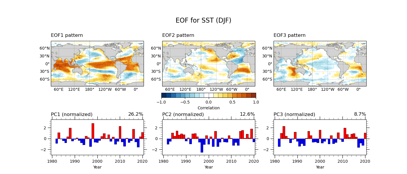
Once we obtain the principal components, we can get the correlation and regression maps with the time series.
# Correlation & Regression
cor1 = xr.corr(pcs[0,:], anmDJF, dim="time")
cor2 = xr.corr(pcs[1,:], anmDJF, dim="time")
cor3 = xr.corr(pcs[2,:], anmDJF, dim="time")
reg1 = xr.cov(pcs[0,:], anmDJF, dim="time")/pcs[0,:].var(dim='time',skipna=True).values
reg2 = xr.cov(pcs[1,:], anmDJF, dim="time")/pcs[1,:].var(dim='time',skipna=True).values
reg3 = xr.cov(pcs[2,:], anmDJF, dim="time")/pcs[2,:].var(dim='time',skipna=True).values
Finaly, we make the figure plot of eigenvectors and principal components for the three leading EOF modes. Let’s see the sample program and its output below.
Source file: eof_sstDJF-v3.py