Plot time series data
This page introduces a program that creates plots of time series data.
Description of data structure and variables
Information is here.
(1) Time series plot
Read one variable
You need to read the dataset (5-minutes in row and hourly in columns) and create one time series data.
        #print(' ----- Read CSV file ------')
        df = pd.read_csv(indir+filename+'.csv' \
            , delimiter = ',',  skiprows=[0,2,3], na_values = ['NAN'], low_memory=False)

        # create initial data frame

        time = addtime(df.loc[:,tlabel])
        newdat = pd.concat([time,pd.DataFrame(np.repeat(df.loc[:,'RECORD':'VersionNum'].values,12,axis=0),columns=list(df.loc[:,'RECORD':'VersionNum']))],axis=1)

        newdat = addrow2(newdat,df,var+'(1)',var+'(12)',var)

        newdat.set_index(tlabel)
‘var’ is the variable name, for example, ‘TAIR1(1)’.
def addrow2(newdat,df,lab1,lab2,newlab):
    for ii in df.index:
     tmp = pd.Series(data=df.loc[ii,lab1:lab2])

     if ii==0:
      newtemp = tmp[::-1]
     else:
      newtemp = pd.concat([newtemp,tmp[::-1]],ignore_index=True)

    newdat = pd.concat([newdat,pd.DataFrame(newtemp,columns=[newlab])],axis=1)
    return(newdat)
This subroutine is to read 12 peices of data (data every 5 minutes) and generate a series of data.
Create a plot
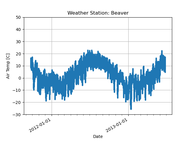
Using a set of variable data and timestamps, let’s plot one-dimensional time series data.
        # ------- Draw Figure -------

        fnFIG=figdir+locname+'.png'
        fig, ax = plt.subplots()

        ax.plot(time,newdat[var], 'o', markersize = 2)

        ax.set_xlabel('Date')
        ax.set_ylabel('Air Temp [C]')
        ax.set_title('Weather Station: '+locname.capitalize())

        # --- Uncomment out for the format of the ticks --
        ax.xaxis.set_major_locator(mdates.YearLocator())
        ax.xaxis.set_major_formatter(mdates.DateFormatter('%Y-%m-%d'))
        ax.xaxis.set_minor_locator(mdates.MonthLocator())
        ax.axis(ymin=-30, ymax=50)

        ax.grid(True)

        fig.autofmt_xdate()
        plt.draw()

        plt.savefig(fnFIG)
You can change the x-axis and y-axis tick intervals depending on the duration of the data. This program uses annual major ticks and monthly minor ticks.
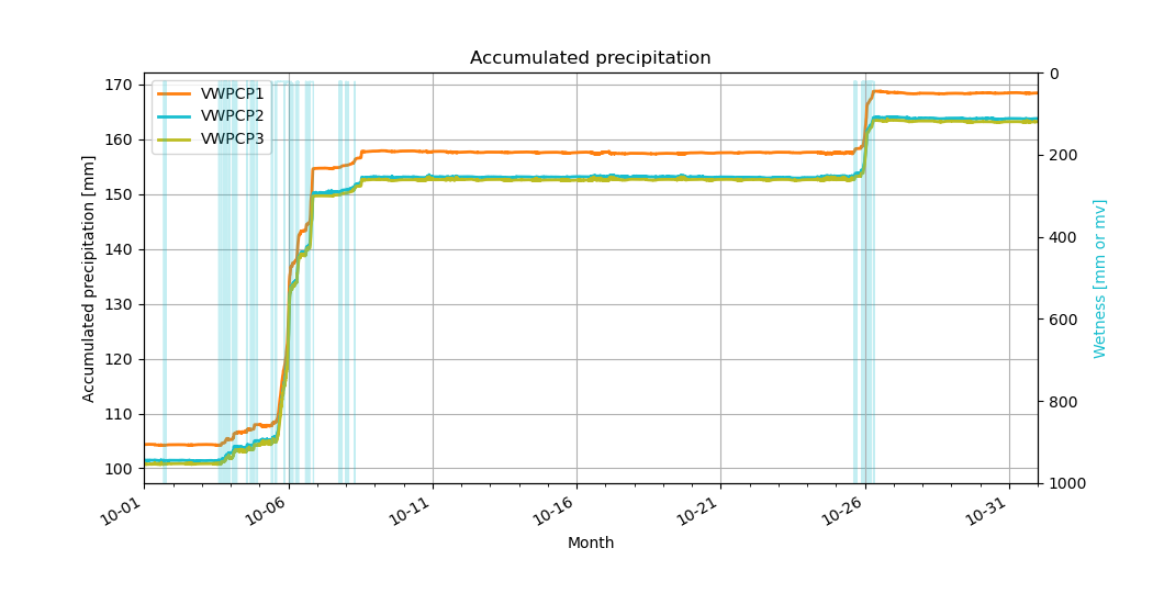
(2) How to make a plot with two different Y-axis
In some cases, you may want to create a single plot that compares two variables with different scales. For example, compare precipitation and wetness data to ensure that these two changes are consistent. In that case, we make a single plot with two different y-axis on the left and right.
Set ‘ax2’ to make another plot using the Y-axis scale on the right.
                 fig, ax1 = plt.subplots()
                 ax2 = ax1.twinx()

                 # plots three sensor data
                 for var in range(0,len(nvar)):
                     tmpdat = pd.DataFrame(ttmax[nvar[var]]).set_index(date)
                     ax1.plot(tmpdat.loc[slice(sdate, edate)].index, tmpdat.loc[slice(sdate,edate)].values, linewidth=1, color = scolor[var], alpha=1., zorder=2, label = nvar[var])
                     ax1.axis(xmin=pd.Timestamp(yyear, mmonth, 1, 0), xmax=pd.Timestamp(nyear, imonth, 1, 0) )
                     del tmpdat
                 ax2.set_ylim(0,1000)
                 ax2.plot(date,dwet, color='C9',linewidth=1,alpha=0.25)
                 ax2.invert_yaxis()

                 ax1.legend()

                 ax1.set_xlabel('Month')
                 ax1.set_ylabel(titleall)
                 ax1.set_title(title)
                 ax2.set_ylabel(title2all,color='C9')
The plot shows precipitation (contour lines) and wetness (lightblue shaded). When the sensor gets wet, the wetness data shows that it is close to zero. Therefore, the plot shows the data in the opposite (y-axis) direction.
Sample program for plots
Source file: plot.Prec_Wet.py