# --- FIGURE PLOT ---
# Layout setting
fig, axes = plt.subplots(nrows=3, ncols=1, figsize=(8, 12))
col = cmaps.amwg # Use the AMWG colormap
# --- Plot 1 ---
ip = 0
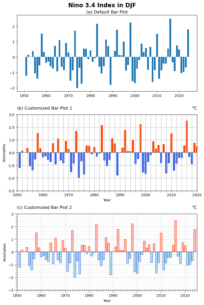
axes[ip].bar(dat_DJF.index, dat_DJF)
axes[ip].set_title("(a) Default Bar Plot")
# --- Plot 2 ---
ip = 1
axes[ip].axhline(0, color="gray", linestyle="-")
positive_color = col.colors[14-2] # Red (adjust index as needed)
negative_color = col.colors[4-2] # Blue (adjust index as needed)
bar_colors = [positive_color if val >= 0 else negative_color for val in dat_DJF]
axes[ip].bar(dat_DJF.index, dat_DJF, color=bar_colors, label="Nino 3.4 index (DJF)")
# Generate tick locations
xtick_major = np.arange(ystr, yend + 1, 10)
ytick_major = np.arange(-3, 3.1, 1)
# Apply to the plot
gvutil.set_axes_limits_and_ticks(
axes[ip],
xlim=(xtick_major[0], xtick_major[-1]),
ylim=(ytick_major[0], ytick_major[-1]),
xticks=xtick_major,
yticks=ytick_major,
xticklabels=xtick_major,
yticklabels=ytick_major
)
# Add minor ticks manually
axes[ip].xaxis.set_minor_locator(MultipleLocator(2)) # Minor ticks every 2 years
axes[ip].tick_params(axis="x", which="minor", length=4)
gvutil.set_titles_and_labels(axes[ip],
maintitle="",
lefttitle="(b) Customized Bar Plot 1",
righttitle="°C",
ylabel="Anomalies",
xlabel="Year",
maintitlefontsize=14, # Adjust main title font size
lefttitlefontsize=12, # Set left title font size
righttitlefontsize=12, # Set left title font size
labelfontsize=10 # Set y-label font size
)
axes[ip].grid(True, which="both", axis="both")
# --- Plot 3 ---
def setup_axis(ax, ystr, yend, ymin, ymax, y_major, y_minor):
# Make grid go below the bars
ax.set_axisbelow(True)
# X-Axis
#ax.xaxis.set_major_locator(MultipleLocator(10))
ax.xaxis.set_minor_locator(MultipleLocator(1))
ax.set_xlim(ystr,yend)
# Y-Axis
ax.set_ylim(ymin, ymax)
ax.yaxis.set_minor_locator(MultipleLocator(y_minor))
# Customized grid setting
ax.tick_params(axis="both", which="major", length=7)
ax.tick_params(axis="both", which="minor", length=4)
ax.grid(visible=True, which="major", linestyle="-", linewidth=0.7, alpha=0.7)
ax.grid(visible=True, which="minor", linestyle="--", linewidth=0.4, alpha=0.5)
ip = 2
positive_color = col.colors[16-2] # Red (adjust index as needed)
negative_color = col.colors[6-2] # Blue (adjust index as needed)
positive_color_edge = col.colors[14-2] # Red (adjust index as needed)
negative_color_edge = col.colors[4-2] # Blue (adjust index as needed)
bar_colors = [positive_color if val >= 0 else negative_color for val in dat_DJF]
edge_colors = [positive_color_edge if val >= 0 else negative_color_edge for val in dat_DJF]
axes[ip].bar(dat_DJF.index, dat_DJF, color=bar_colors, edgecolor=edge_colors,
linewidth=1, label="Nino 3.4 index (DJF)")
setup_axis(axes[ip], ystr, yend+1, -3., 3., 1, 0.2)
gvutil.set_titles_and_labels(axes[ip],
maintitle="",
lefttitle="(c) Customized Bar Plot 2",
righttitle="°C",
ylabel="Anomalies",
xlabel="Year",
maintitlefontsize=14, # Adjust main title font size
lefttitlefontsize=12, # Set left title font size
righttitlefontsize=12, # Set left title font size
labelfontsize=10 # Set y-label font size
)
axes[ip].axhline(0, color="gray", linestyle="-")
#axes[ip].legend()
# Apply the overall figure title
fig.suptitle("Nino 3.4 Index in DJF", fontsize=16, fontweight="bold")
# --- OUTPUT ---
plt.tight_layout()
plt.savefig(fnFIG, dpi=300, bbox_inches="tight")
plt.show()