# --- FIGURE PLOT ---
# Layout setting
fig, axes = plt.subplots(nrows=3, ncols=1, figsize=(8, 12))
col = cmaps.amwg # Use the AMWG colormap
# --- Modify HERE ---
# Each panel plot
ip = 0
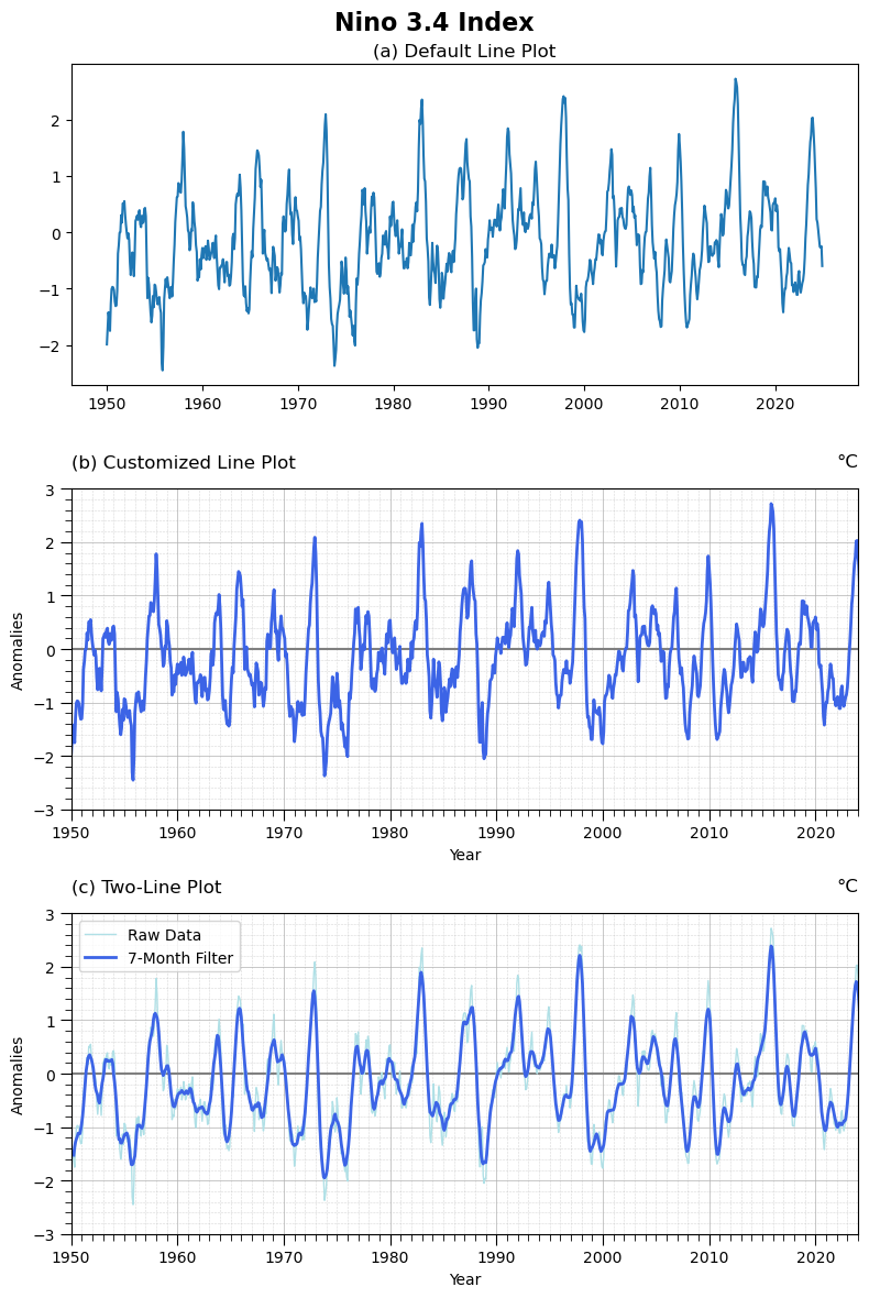
axes[ip].plot(dat.index, dat)
axes[ip].set_title("(a) Default Line Plot")
def setup_axis(ax, ystr, yend, ymin, ymax, y_major, y_minor):
# Make grid go below the bars
ax.set_axisbelow(True)
# X-Axis
ax.xaxis.set_major_locator(mdates.YearLocator(10))
ax.xaxis.set_minor_locator(mdates.YearLocator(1))
ax.xaxis.set_major_formatter(mdates.DateFormatter("%Y"))
ax.set_xlim(pd.to_datetime(f"{ystr}"), pd.to_datetime(f"{yend}"))
# Y-Axis
ax.set_ylim(ymin, ymax)
ax.yaxis.set_minor_locator(MultipleLocator(y_minor))
# Customized grid setting
ax.tick_params(axis="both", which="major", length=7)
ax.tick_params(axis="both", which="minor", length=4)
ax.grid(visible=True, which="major", linestyle="-", linewidth=0.7, alpha=0.7)
ax.grid(visible=True, which="minor", linestyle="--", linewidth=0.4, alpha=0.5)
ip = 1
axes[ip].axhline(0, color="gray", linestyle="-")
axes[ip].plot(dat.index, dat, label="Nino 3.4 index", color=col.colors[4-2], linewidth=2)
setup_axis(axes[ip], ystr, yend, -3., 3., 1, 0.2)
gvutil.set_titles_and_labels(axes[ip],
maintitle="",
lefttitle="(b) Customized Line Plot",
righttitle="°C",
ylabel="Anomalies",
xlabel="Year",
maintitlefontsize=14, # Adjust main title font size
lefttitlefontsize=12, # Set left title font size
righttitlefontsize=12, # Set left title font size
labelfontsize=10 # Set y-label font size
)
ip = 2
dat_7mo = dat.rolling(window=7, center=True, min_periods=7).mean()
axes[ip].axhline(0, color="gray", linestyle="-")
axes[ip].plot(dat.index, dat, label="Raw Data", color=col.colors[6-2], linewidth=1)
axes[ip].plot(dat_7mo.index, dat_7mo, label="7-Month Filter", color=col.colors[4-2], linewidth=2)
setup_axis(axes[ip], ystr, yend, -3., 3., 1, 0.2)
gvutil.set_titles_and_labels(axes[ip],
maintitle="",
lefttitle="(c) Two-Line Plot",
righttitle="°C",
ylabel="Anomalies",
xlabel="Year",
maintitlefontsize=14, # Adjust main title font size
lefttitlefontsize=12, # Set left title font size
righttitlefontsize=12, # Set left title font size
labelfontsize=10 # Set y-label font size
)
axes[ip].legend()
# Apply the overall figure title
fig.suptitle("Nino 3.4 Index", fontsize=16, fontweight="bold")
# --- OUTPUT ---
plt.tight_layout()
plt.savefig(fnFIG, dpi=300, bbox_inches="tight")
plt.show()